When you visit a beautifully designed website, have you ever wondered how it all comes together? How do the colors, fonts, layouts, and animations work seamlessly to create an engaging user experience?
Well, the magic behind it all is CSS (Cascading Style Sheets).
If HTML is the skeleton of a website, then CSS is the skin, clothes, and accessories—it makes everything look appealing! Without CSS, every webpage would just be plain black text on a white background. Imagine Facebook or YouTube without any colors, spacing, or layout—just one long wall of text.
In this guide, we’ll break down CSS in simple, relatable terms so that even if you’re completely new to coding, you’ll understand how to use CSS to style your web pages. Let’s dive in!
What is CSS?
Before we start writing CSS, we need to understand what it is and why it’s so important.
CSS (Cascading Style Sheets) is a stylesheet language used to control the appearance and layout of web pages.
Think of it this way:
- HTML builds the walls, doors, and windows of a house.
- CSS paints the walls, arranges the furniture, and adds decorations.
Without CSS, every webpage would look dull and unstructured. CSS allows you to change:
✔ Colors
✔ Fonts
✔ Spacing
✔ Layout
✔ Animations
✔ And much more!
Now that you understand what CSS does, let’s see how it works and how we can start using it.
How CSS Works
CSS works by selecting HTML elements and applying styles to them. You write CSS rules that tell the browser how to display different elements on the page.
Let’s break down a simple example:

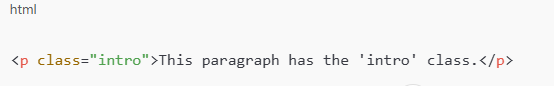
Breaking It Down:
- p → This is the selector (it targets all <p> elements).
- color: blue; → This changes the text color to blue.
- font-size: 18px; → This makes the text 18 pixels tall.
Now, every paragraph on your webpage will appear in blue! 🎨
But where do we write CSS? Let’s explore the different ways CSS can be added to a webpage.
Ways to Apply CSS
There are three main ways to use CSS:
1. Inline CSS (Applied directly inside an HTML tag)

✅ Quick and easy
❌ Not recommended for large projects (messy & hard to maintain)
2. Internal CSS (Written inside <style> in the HTML file)

✅ Works well for small projects
❌ Not reusable for multiple pages
3. External CSS (Best practice – written in a separate .css file)

✅ Keeps HTML and CSS separate
✅ Easy to maintain
✅ Can be used across multiple pages
For larger projects, external CSS is the best choice because it keeps your styles organized.
Now that we know where to write CSS, let’s talk about how to target elements using CSS selectors.
Understanding Selectors: The Core of CSS
Selectors are how CSS targets elements to style them. They tell the browser which elements the CSS rules should apply to.
Here are some common selectors and how they work:
1. Element Selector (Styles all elements of a type)

👉 This applies to all <h1> tags.
2. Class Selector (Styles elements with a specific class)

👉 Use classes when you want to style multiple elements differently.
3. ID Selector (Styles a single element with a unique ID)


👉 IDs should be unique—only one element should have a particular ID.
4. Grouping Selector (Styles multiple elements together)

👉 Both <h1> and <p> will have dark gray text.
Selectors are important because they help us target elements efficiently. But once we select an element, how do we control its size and spacing? Let’s talk about the Box Model.
The Box Model: Understanding Spacing in CSS
Every HTML element is like a box. The Box Model helps you control its size and spacing.
Box Model Components
🔹 Content – The actual text or image inside the element
🔹 Padding – Space inside the border (between content and border)
🔹 Border – The edge of the element
🔹 Margin – Space outside the border (creates distance between elements)
Example:

This means:
- The box is 200px wide
- It has 20px padding inside
- A 5px solid black border
- 30px margin around it
Once you understand spacing, the next step is arranging elements on the page with positioning.
CSS Positioning: Arranging Elements on the Page
CSS lets you position elements in different ways:
1. Static (Default)

✅ Normal document flow
2. Relative (Moves from its normal position)

✅ Moves 20px down and 10px right
3. Absolute (Removed from normal flow, positioned relative to nearest ancestor)

✅ Fixed at 50px from top, 100px from left
4. Fixed (Stays in place when scrolling)

✅ Great for sticky headers!
We’ve already covered how CSS is the magic that makes websites look great. Without it, every webpage would just be plain text stacked on top of each other. But making a website look nice isn’t just about colors and fonts—it’s also about motion, layout, and responsiveness
A CSS guide wouldn’t be complete without discussing Transitions, Animations, Flexbox, Grid, and Responsiveness, —these are crucial for modern web design. Let’s dive deeper and make this guide even more comprehensive and educational!
In this extended guide, we’ll explore:
✅ Transitions & Animations – Adding motion and interactivity
✅ CSS Flexbox – Arranging elements horizontally & vertically
✅ CSS Grid – Creating powerful two-dimensional layouts
✅ Responsive Design – Making websites mobile-friendly
By the end, you’ll have a solid foundation in modern CSS techniques to style web pages like a pro.
CSS Transitions: Smooth Effects on Hover
Want to make buttons or links feel more interactive? CSS transitions let you add smooth effects when users hover over or click elements.
Basic Transition Example

🔹 The background color changes smoothly instead of switching instantly!
Common Transition Properties

Transitions work for buttons, links, images, and any UI element that needs interactivity.
CSS Animations: Adding Life to Webpages
If you want elements to move or fade in automatically, CSS animations let you do that!
Basic Animation Example


💡 This makes the ball bounce up and down forever!
When to Use Animations
✔ Loading animations
✔ Button hover effects
✔ Page transitions
✔ Attention-grabbing elements
CSS Flexbox: Arranging Elements Easily
Imagine you’re designing a navigation bar or a row of product cards. You could use margins and padding, but that can get messy. Instead, Flexbox makes arranging elements easy!
How Flexbox Works
Flexbox is a one-dimensional layout system that arranges items in a row or column with powerful alignment controls.
Basic Flexbox Example


Important Flexbox Properties

Flexbox is great for navigation bars, buttons, cards, and sidebars. But what if you need a full-page layout with rows and columns? That’s where CSS Grid comes in.
CSS Grid: Building Full Layouts
Flexbox is great for one-dimensional layouts, but what if you need rows AND columns? CSS Grid lets you design powerful two-dimensional layouts like dashboards, galleries, or full-page designs.
Basic CSS Grid Example


💡 What’s Happening?
- grid-template-columns: repeat(3, 1fr); → Creates three equal columns
- gap: 20px; → Adds spacing between grid items
When to Use Flexbox vs. Grid

Responsive Design: Making Websites Mobile-Friendly
Did you know that over 60% of web traffic comes from mobile devices? 📱
If your website isn’t responsive, it won’t look good on smaller screens. That’s where media queries come in!
Basic Responsive Design Example

✅ This makes the layout horizontal on desktops but stacks vertically on mobile devices.
Responsive Best Practices
✔ Use relative units like %, vw, vh, and rem instead of fixed px
✔ Use flexible layouts with Flexbox or Grid
✔ Use media queries to adjust styles for different screen sizes
Final Thoughts: Start Styling Like a Pro!
CSS is more than just colors and fonts—it’s a powerful tool for designing beautiful, responsive, and interactive websites. By mastering Flexbox, Grid, Responsiveness, Transitions, and Animations, you’ll be able to create professional-looking websites that feel great to use.
Want to learn CSS the right way?
🔥 Join Odurinde.com—the online training experts! Learn modern web development with hands-on practice and real-world projects. 🚀
👉 Start now at odurinde.com


 Google